Saturday, 12 March 2011

Task 2 - Creating the Poster

For my poster, I am going to create a tree using a similar 3D sculpture to that I made in Task 1 as the main, green part of the tree. I want to use paper detail similar to that of artist Yulia Brodskaya for the "100" text and the tree trunk.


I began by creating the main part of the tree in a bright green that I feel will really stand out.


I created several A4 sheets and stuck them together to create a much larger and rounder sculpture than I had in task 1. This larger sculpture is much more similar to the shape of a tree.


I then created the "100" text using white paper on a dark green background. I have added spiral details into the centre.


Next I made the trunk using brown paper on white. I found this quite tricky to do as it was hard to make the small pieces of paper stick and it is very delicate, but I am pleased with the outcome. I also added a flat piece of green paper to represent grass and make the tree seem part of a scene rather than an object on its own.


I then placed these together on a piece of paper. I balanced the "100" on the top of the sculpture and placed the tree trunk underneath. I think the fact that the "100" is much higher up when I photograph it, will make it stand out and this is the first thing the viewers eye will be drawn to.


From a different angle:


Thursday, 10 March 2011

Yulia Brodskaya

I have found this work which I think is amazing by Yulia Brodskaya. She uses paper in a very intricate and detailed way to create stunning designs.


She has a technique where she uses strips of different coloured paper to create her images. I love the detail she can create doing this and the bright colours she uses in the typography work, which really stand out against the white backgrounds she uses. I really like this technique and I would like to include it in my final piece.

Tuesday, 8 March 2011

Task 2 ideas

The brief for task 2 is:

Respond to this brief employing the techniques acquired during Skills Task 1 . You are asked to design and construct a poster celebrating 100 years of GF Smith Paper Company.

Explore paper in all its forms - fold, score, cut and construct using a variety of paper stock to develop and create your poster designs. Consider how photography can be used to compose and frame your paper constructions. Be as inventive and creative as possible - what can you construct that celebrates the multitude of uses paper has.

I have looked at GF Smith to see what their brand is like.


They seem to use very simple text in the majority to their designs so I will do this too for the final poster.

When thinking of paper, the first thing that comes to my mind is trees, as paper is created from them. Therefore I will try to create a design representing a tree to link to the 100 years of GF Smith Paper. The image of a tree also suggests age, maturity, permanence and stability.  These are all qualities that would reflect well on the company. The tree also links with the floral/organic theme from task 1 which I would like to develop further in this task.
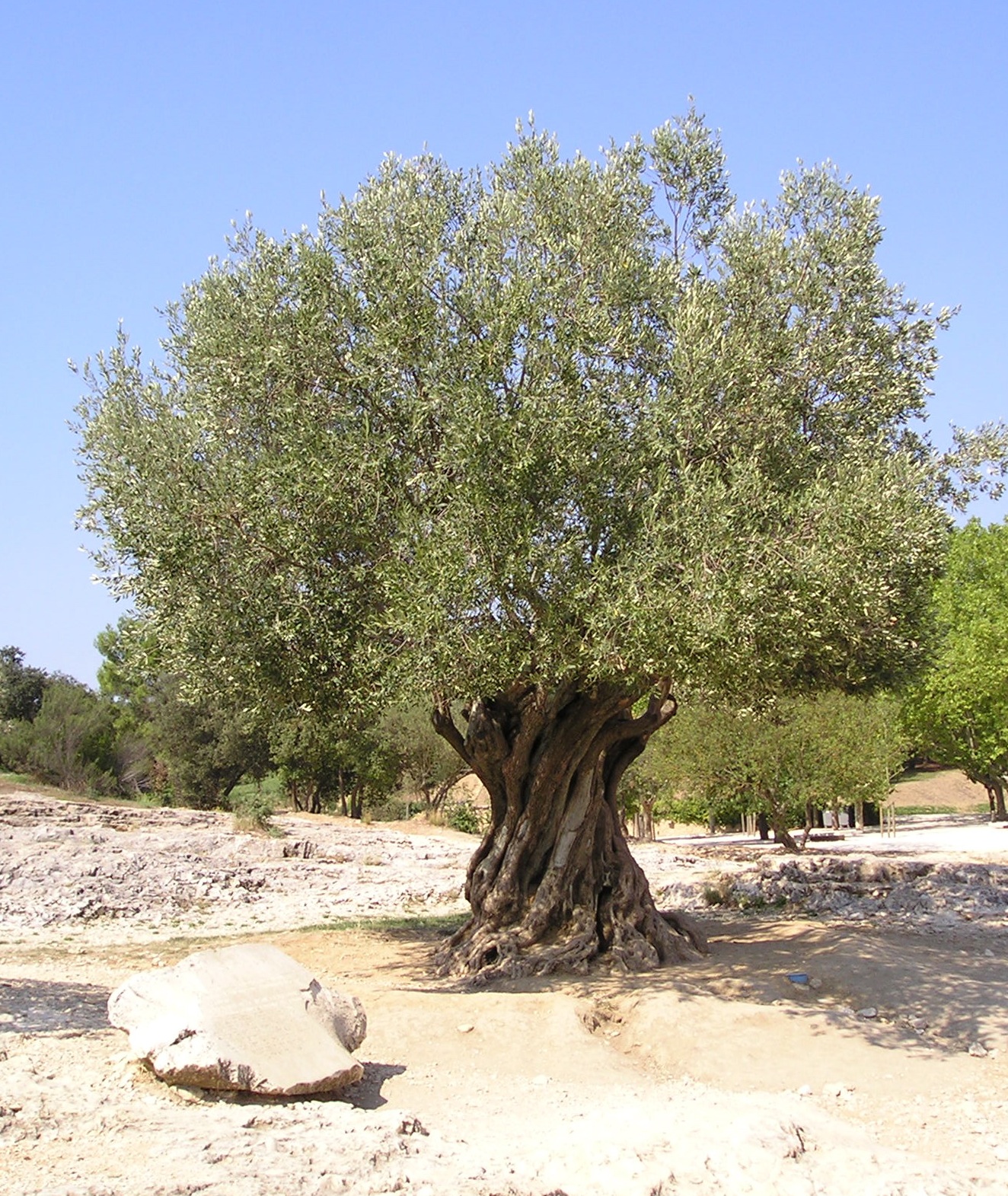
I have looked at images of trees to see how I could incorporate them into my final design.


I have also looked at trees created by designers such as these:


This is a paper tree created as packaging by designer Changzhi Lee. I like the way the tree pops up from the page. It is very detailed with intricately cut leaves and roots.


This is by designer Oskar Alvarado. I really like the use of realistic colour in this and I think it works much better than using just white. I also like the contrast between the spikey shape of the branches and the circular leaves.


This was made by Judy Morrow. I like the colours in this too, as they are very realistic. However, I feel they seem slightly more washed out and do not stand out as well as the previous image. I like the shape of the tree; the roundness of it would give a good frame for text.


Helen Mussell White

For my poster, I want to keep with the nature theme that I used for the 3D model.


A paper artist I have found who creates a lot of pieces based on nature is Helen Mussell White. I find her work very appealing and I like the way she has layered the paper to give a 3D effect.


 She mixes simple cut out forms of animals with much more intricate and detailed ones of the plant life around them. In my favourite pieces of her work she uses bold colours to create visually appealing and eye catching designs.


Unlike the other artists I have looked at previously, she cuts out complete shapes to create a whole picture rather than using lots of folds to create a single object. However the way she places them on the page still makes them feel 3D.

For my poster I also want to use bold block colours that appeal to me in some of her designs. I think the use of colour helps to contrast the designs with the background and will make the design stand out.

Monday, 7 March 2011

Task 1 - 3D Scupture

Here is my final 3D piece I created for Task 1.

 
It is created of 6 pieces that look like this:

The cuts in the paper are 1cm wide and the paper used is a normal A4 piece.

I sewed the pieces together in a cicle to create a flowerlike shape. Originally, I had wanted to keep a gap in the middle of the sculpture but they did not stay together as well as I had hoped. To add extra support to it, I added 3 pieces of card in the centres of both sides of the sculpture, then added a circle over them to hide them.

Using a pencil, I curled the ends of the outside layer of each section.


I am mostly pleased with my final piece. I wanted it to represent a natural, organic form which I think it does.  I am disappointed in having the centre blocked with a paper circle. Maybe if I had used stronger paper or card I would have succeeded in sticking the sections together without the need for extra support. I am sure I would have been happier with the outcome if I had managed this.

Saturday, 5 March 2011

Task 1 ideas

I have decided to use the skills from workshop 2 for my 3D sculpture.


I have experimented with various ways of putting the paper together, such as making the base of it tighter, changing the size of the cuts in the paper and changing the size of the paper.

This uses 1cm strips of paper with a fairly wide base. I think it looks a lot like a flower and I really like this method.

 This is the same method but with the edges curled with a pencil. I think this makes it look like an opening flower and makes it more interesting.

 
With this I have mixed an A4 piece of paper and an A5 piece in the middle. I think this helps to give the impression of the centre of a flower with the petals around it. I think that this could be enhanced by using different colours for the centre and outside.

With this, I cut all the way through the paper instead of folding it over like I did with the rest. I also cut the paper very finely to get a lot more strips of paper. It looks much more messy than the others. It reminds me of fireworks.

The way the fireworks curve at the ends is very similar to the paper. I was able to create this by curling the paper around a pencil.

  
This is created in the same way as the first picture, except the strips of paper are half the size. As I want to create a fairly big sculpture I think that using bigger strips will be a better idea as smaller ones might make it seem a bit busy.
 
 I made this by crumpling each of the strips of paper. This reminds me a lot of an anemone as the creases in the paper make it look like it is swaying under the water.

Tuesday, 1 March 2011

Paul Jackson

I have been looking at some of the work of origami artist Paul Jackson. As well as making the traditional types of origami such as animals and commercial objects, he also creates amazing pieces based around organic forms. They are very detailed and complex with repeatitive patterns. The soft, pastel colours he uses also reflect the organic forms. These make his sculptures look much more realistic than if he used white or brightly coloured paper. The texture, colour and way the paper is folded make the sculpture look as if it is made from wood which, in a sense, it is as that is where the paper originally comes from.


These remind me of potpourri. The top one looks like an almond and the second looks like a pinecone. They look like dried out seeds or fruit peelings.