Thursday 31 March 2011

Stop Motion

Today we used the software "iStopMotion" to practise creating our own animations. We only had 45 minutes, so it is far from perfect and my hand is in a fair few of the shots but I had a lot of fun with it! We managed to get fairly realistic movement and portray a story in a short amount of time.


It is a fairly quick but effective method of animating. I definitely think it is something I will consider for my final animation.

Tuesday 29 March 2011

Rayograms

For our workshop today, we created rayograms which involves placing objects on light sensitive paper.

Rayograms were popularised by Man Ray, hence their name. Here is one of his films which feature many of his rayograms:


During my foundation art and design course I worked in a dark room so I knew some of the principles but I had only used negatives so this was quite different.

For my rayogram I used twigs. First I created a test strip to see how long I needed to expose the paper.

 This shows strips of 5, 10, 15 and 20 seconds.

I decided I prefered the darker strip so I exposed a whole piece of paper for 20 seconds. 


I held some of the twigs up above the paper and this makes them look brighter and unfocused. I think if I had done a lot more of this it would have looked very interesting and the blurred lines make it seem spooky, but I didn't have enough hands to hold anymore!

I'm not sure if rayograms will work for my animation as I want to create a story based idea and rayograms are much more abstract.

Monday 28 March 2011

This is my only previous experience with animation; a film I made with a friend during my Art Foundation course. It is certainly not as good as I would have liked, but it shows some animation and film we created to go along with this music. I certainly hope I can improve my skills a lot during this project!

Music Videos

I have looked at music videos that have animation in to see how they mix together the sound and animation.

"I will follow you into the dark" by Death Cab for Cutie. This just uses static drawings but as the pages of the book are turned they seem to come to life.

"Just the way you are" by Bruno Mars. This uses stop motion and digital animation mixed with film. The animation related to the lyrics of the song and the animated drum and bell beats in time with the music. There aren't any lyrics in my piece of music so I will have to link my animation to the sounds and rhythm.

"Harder Better Faster" by Daft Punk. This uses anime style animation and the movement of the objects go really well with the beat of the music.

"Hit that" by The Offspring. This mostly uses film but the faces of the person and dog have been digitally animated. The movement in the film, such as walking fast, matches the rhythm of the music.

"Feel Good Inc." by Gorillaz. This mainly uses cell animation with a small amount of film. The characters sing and dance in time with the music.

Sunday 27 March 2011

Three words...

The words I have chosen are:

Tension

Western

Heat

Concierto de Aranjuez

The song I have been given is "Concierto de Aranjuez (Part Two Ending)".


After listening to it a few times, I put together a mindmap of all the things the music reminded me of.


I think that the Mexico theme is probably the one I will focus on as I get a sense of this most strongly from the music. I need to research the best way I can represent this theme using the different animation techniques. 

I made a mood board and found images of lots of different things that remind me of Mexico.


Though Spaghetti Westerns were made in Italy, the stories were usually set in Mexico around the Mexican Revolution.

Friday 25 March 2011

Print to Pixel

For the Print to Pixel Project I will be making a 20-30 second film based around a piece of music. I haven't really done much animation before but I really love animated films so I'm looking forward to learning the new techniques.
Here are some clips from my favourite animated films:
 
 
From the film "Howl's Moving Castle" by Hayao Miyazaki which was completely hand drawn. I think the beautiful drawings in all Miyazaki films are breath taking and so detailed I can understand why his films can take years to create.

 
 From the short film "Flat World". The film was shot using a combination of cardboard cut-outs and traditional cell animation. I think the lighting in this film is very clever and atmospheric.

 
Short digital animation, "The Piano". This has quite simple images but fits with the music perfectly making for a very emotional piece. The characters move in time to the music, either from actually playing the piano or from their actions. There is also a different animation in each section of the music.

 
From the film "Coraline" by Tim Burton which uses stop motion. I really like Tim Burton's films because he uses really unusal and interesting characters and stories.

 
 Animation from the film "Harry Potter and the Deathly Hallows" used to illustrate a story. I think the silhouettes are very effective and reminisant of Tim Burton's techniques.

Monday 14 March 2011

Task 2 - Final Poster

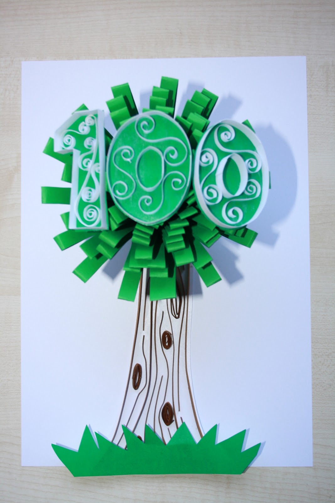
Here is my final poster. This shows how I experiemented with the poster while photographing it to get the image as I wanted it.


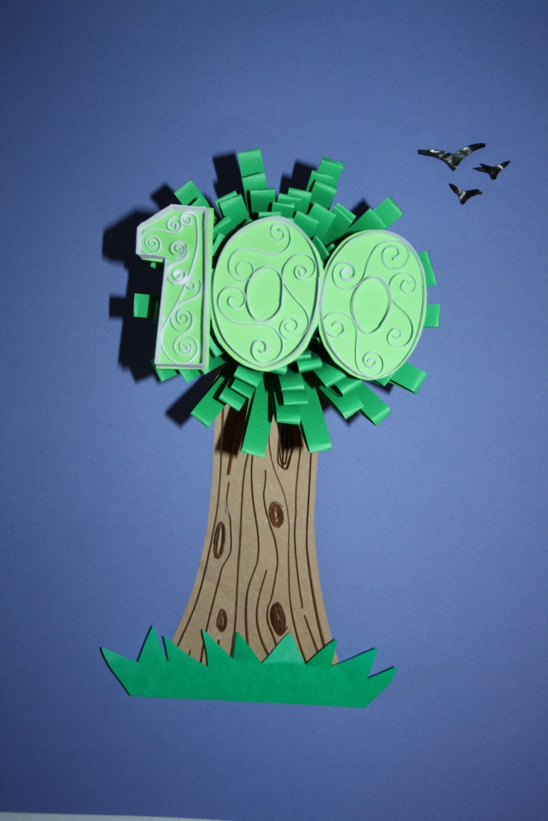
Looking at my poster, I felt that the 100 didn't stand out enough from the background. I was also having trouble photographing it well as there was so much glue on the numbers from sticking in the spirals that there was a lot of glare from the flash. I found a lighter green which I replaced as the background of the 100 and I think this is much easier to see.


I felt that the white background was a bit dull for my poster so I started to experiment with different colours. I found I liked blue the best as it was reminiscent of the sky. However I felt that this blue was too dark...


...and this blue was too light. It looks almost white and doesn't make for a very interesting and eye catching poster.


I felt this blue was just right. It is bold and bright and highlights the tree and the 100 really well.


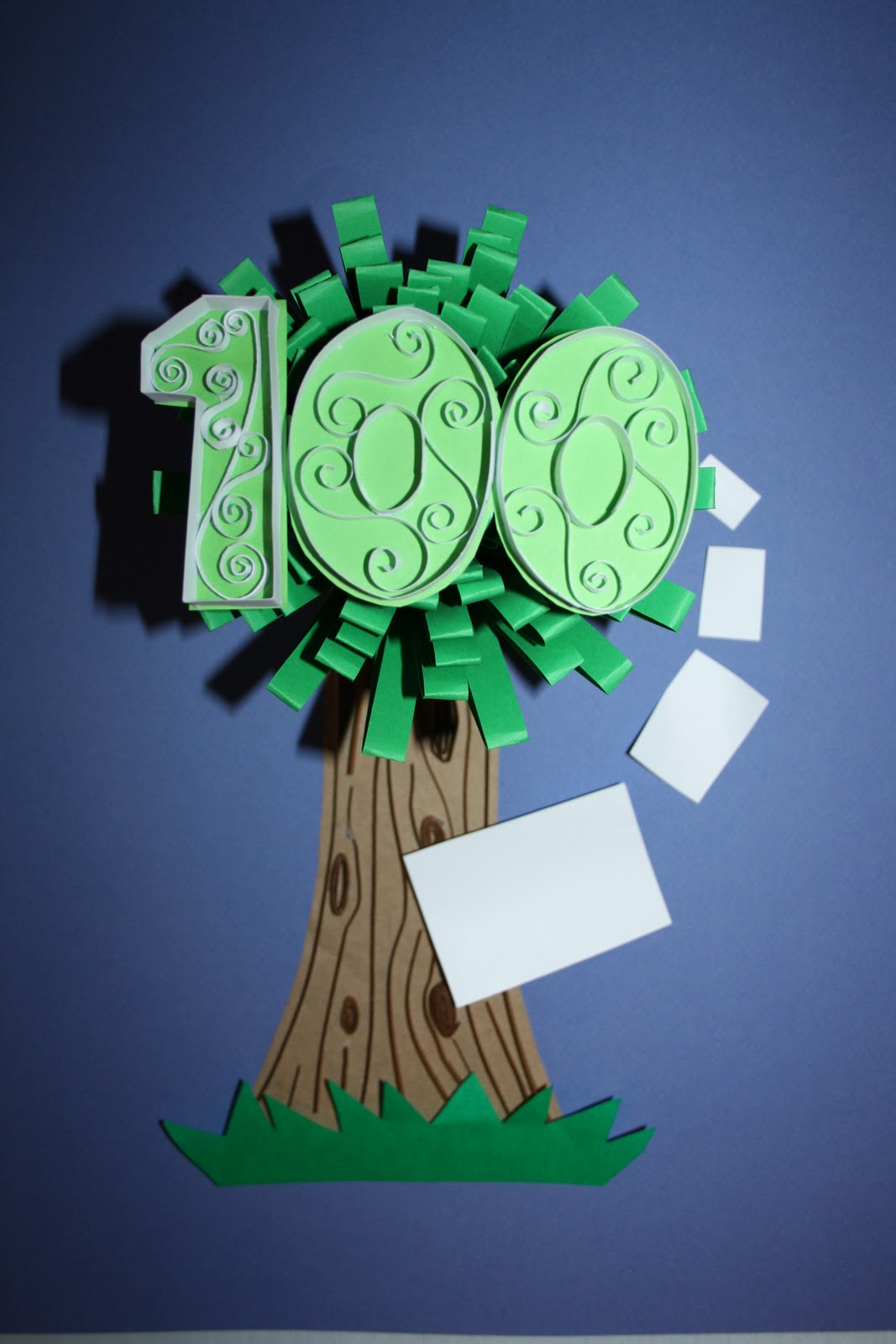
I added some birds into the sky. I also felt I needed somewhere to put the "Design Museum" and "1-31 July 2011" text, so I added white pieces of paper. These represent real pieces of paper coming out of the tree from where it was made.


I decided against the birds as I felt they made the image too busy.


I was pleased with this and able to now add the rest of the text. The 100 is much more in focus than the tree trunk which I think makes it stand out. I think the shadow around the tree helps to bring more attention to the "100" in the centre.


The font I added is bold and simple which I think reflects the brand of the company. I think that the tree looks quite rural whereas the "100" is quite stylish, showing the varity of uses the paper has.

 I am fairly pleased with this final piece as I think the important parts of the message are really clear and easy to understand. The tree is quite attractive and the colours are eye catching. The different paper techniques used reflect the diversity of paper and the qualities of the company.  

I think that when the poster was printed at A2 size, it lost some of the finer detail and appeal. I think I could have improved this by making the sculpture bigger, therefore then being able to fit more detailed and intricate patterns inside the "100" text. Also, the paper sheets seem too flat meaning that the place and date text doesn't stand out as much as I wanted it to.

If I had more time I would make the paper sheets coming out of the tree more curved and 3D to make them look as if they were flying from the tree.

Overall, I found this project fairly hard as I have never worked much in 3D design and I found it difficult to include the high level of detail I wanted. I definitly think I am better suited to 2D work. However, it was interesting to try out things I hadn't done before and learn new techniques, especially learning more about the cameras and photography.

Saturday 12 March 2011

Task 2 - Creating the Poster

For my poster, I am going to create a tree using a similar 3D sculpture to that I made in Task 1 as the main, green part of the tree. I want to use paper detail similar to that of artist Yulia Brodskaya for the "100" text and the tree trunk.


I began by creating the main part of the tree in a bright green that I feel will really stand out.


I created several A4 sheets and stuck them together to create a much larger and rounder sculpture than I had in task 1. This larger sculpture is much more similar to the shape of a tree.


I then created the "100" text using white paper on a dark green background. I have added spiral details into the centre.


Next I made the trunk using brown paper on white. I found this quite tricky to do as it was hard to make the small pieces of paper stick and it is very delicate, but I am pleased with the outcome. I also added a flat piece of green paper to represent grass and make the tree seem part of a scene rather than an object on its own.


I then placed these together on a piece of paper. I balanced the "100" on the top of the sculpture and placed the tree trunk underneath. I think the fact that the "100" is much higher up when I photograph it, will make it stand out and this is the first thing the viewers eye will be drawn to.


From a different angle:


Thursday 10 March 2011

Yulia Brodskaya

I have found this work which I think is amazing by Yulia Brodskaya. She uses paper in a very intricate and detailed way to create stunning designs.


She has a technique where she uses strips of different coloured paper to create her images. I love the detail she can create doing this and the bright colours she uses in the typography work, which really stand out against the white backgrounds she uses. I really like this technique and I would like to include it in my final piece.

Tuesday 8 March 2011

Task 2 ideas

The brief for task 2 is:

Respond to this brief employing the techniques acquired during Skills Task 1 . You are asked to design and construct a poster celebrating 100 years of GF Smith Paper Company.

Explore paper in all its forms - fold, score, cut and construct using a variety of paper stock to develop and create your poster designs. Consider how photography can be used to compose and frame your paper constructions. Be as inventive and creative as possible - what can you construct that celebrates the multitude of uses paper has.

I have looked at GF Smith to see what their brand is like.


They seem to use very simple text in the majority to their designs so I will do this too for the final poster.

When thinking of paper, the first thing that comes to my mind is trees, as paper is created from them. Therefore I will try to create a design representing a tree to link to the 100 years of GF Smith Paper. The image of a tree also suggests age, maturity, permanence and stability.  These are all qualities that would reflect well on the company. The tree also links with the floral/organic theme from task 1 which I would like to develop further in this task.
I have looked at images of trees to see how I could incorporate them into my final design.


I have also looked at trees created by designers such as these:


This is a paper tree created as packaging by designer Changzhi Lee. I like the way the tree pops up from the page. It is very detailed with intricately cut leaves and roots.


This is by designer Oskar Alvarado. I really like the use of realistic colour in this and I think it works much better than using just white. I also like the contrast between the spikey shape of the branches and the circular leaves.


This was made by Judy Morrow. I like the colours in this too, as they are very realistic. However, I feel they seem slightly more washed out and do not stand out as well as the previous image. I like the shape of the tree; the roundness of it would give a good frame for text.


Helen Mussell White

For my poster, I want to keep with the nature theme that I used for the 3D model.


A paper artist I have found who creates a lot of pieces based on nature is Helen Mussell White. I find her work very appealing and I like the way she has layered the paper to give a 3D effect.


 She mixes simple cut out forms of animals with much more intricate and detailed ones of the plant life around them. In my favourite pieces of her work she uses bold colours to create visually appealing and eye catching designs.


Unlike the other artists I have looked at previously, she cuts out complete shapes to create a whole picture rather than using lots of folds to create a single object. However the way she places them on the page still makes them feel 3D.

For my poster I also want to use bold block colours that appeal to me in some of her designs. I think the use of colour helps to contrast the designs with the background and will make the design stand out.

Monday 7 March 2011

Task 1 - 3D Scupture

Here is my final 3D piece I created for Task 1.

 
It is created of 6 pieces that look like this:

The cuts in the paper are 1cm wide and the paper used is a normal A4 piece.

I sewed the pieces together in a cicle to create a flowerlike shape. Originally, I had wanted to keep a gap in the middle of the sculpture but they did not stay together as well as I had hoped. To add extra support to it, I added 3 pieces of card in the centres of both sides of the sculpture, then added a circle over them to hide them.

Using a pencil, I curled the ends of the outside layer of each section.


I am mostly pleased with my final piece. I wanted it to represent a natural, organic form which I think it does.  I am disappointed in having the centre blocked with a paper circle. Maybe if I had used stronger paper or card I would have succeeded in sticking the sections together without the need for extra support. I am sure I would have been happier with the outcome if I had managed this.

Saturday 5 March 2011

Task 1 ideas

I have decided to use the skills from workshop 2 for my 3D sculpture.


I have experimented with various ways of putting the paper together, such as making the base of it tighter, changing the size of the cuts in the paper and changing the size of the paper.

This uses 1cm strips of paper with a fairly wide base. I think it looks a lot like a flower and I really like this method.

 This is the same method but with the edges curled with a pencil. I think this makes it look like an opening flower and makes it more interesting.

 
With this I have mixed an A4 piece of paper and an A5 piece in the middle. I think this helps to give the impression of the centre of a flower with the petals around it. I think that this could be enhanced by using different colours for the centre and outside.

With this, I cut all the way through the paper instead of folding it over like I did with the rest. I also cut the paper very finely to get a lot more strips of paper. It looks much more messy than the others. It reminds me of fireworks.

The way the fireworks curve at the ends is very similar to the paper. I was able to create this by curling the paper around a pencil.

  
This is created in the same way as the first picture, except the strips of paper are half the size. As I want to create a fairly big sculpture I think that using bigger strips will be a better idea as smaller ones might make it seem a bit busy.
 
 I made this by crumpling each of the strips of paper. This reminds me a lot of an anemone as the creases in the paper make it look like it is swaying under the water.